Posts

How to Join Data in Tableau: A Comprehensive Guide

![How to Join Data in Tableau](/blog-post-1.jpg) Data joining is a critical aspect of data analysis and visualization in Tableau. By combining data from multiple sources, you can uncover valuable insights and create more comprehensive visualizations. In this article, we will explore various techniques and best practices to join data in Tableau effectively. ## 1. Understanding Data Joining in Tableau ### What is Data Joining? In Tableau, data joining refers to the process of combining data from different data sources based on common columns or fields. By joining data, you can merge related information into a single dataset, enabling you to perform comprehensive analysis and visualizations. ### Keyword Search Intent: Types of Joins in Tableau Tableau supports various types of joins, each serving specific purposes. Understanding these join types will help you choose the appropriate one for your analysis: 1. Inner Join: Retrieves matching records from both tables while discarding non-match

How to Annotate in Tableau: A Comprehensive Guide

![How to Annotate in Tableau](/blog-post-1.jpg) Annotating is an essential feature in Tableau that allows you to add context, explanations, and insights to your data visualizations. Annotations can greatly enhance the communication and interpretation of your data. In this comprehensive guide, we will explore various techniques and strategies to effectively annotate in Tableau, enabling you to create impactful and informative visualizations. Tableau is a versatile and powerful data analysis tool that enables users to transform raw data into interactive and insightful visualizations. By leveraging annotations, you can provide additional context, highlight important data points, and emphasize key insights within your visualizations. Whether you are a beginner or an advanced Tableau user, this guide will equip you with the necessary knowledge to make the most out of annotations in Tableau. ## Segment 1: Why Annotations Matter in Tableau In Tableau, annotations serve as powerful tools to en

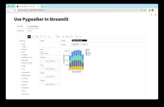
Streamlit Easy Data Visualisation by Using PyGWalker

Image
Streamlit Easy Data Visualisation by Using PyGWalker Get ready to embark on a thrilling adventure into the world of data exploration with Streamlit and Pygwalker! Discover the incredible capabilities of these two powerful Python libraries as we delve into interactive data visualization and analysis. Introducing Streamlit Streamlit is a game-changing Python library that takes the hassle out of building interactive web applications from your data scripts. Say goodbye to the complexities of web development and coding challenges! Streamlit is fast, open-source, and free, making it the perfect solution for creating and sharing data applications. What Can Pygwalker Do? Pygwalker is another fantastic Python library designed specifically for data analysis and visualization. With Pygwalker, data scientists and analysts can effortlessly generate captivating visualizations such as scatter plots, line plots, bar charts, and histograms. The best part is, you don't need any coding skills to use

What If Analysis in Tableau - Discover Insights and Optimize Decision Making

![What If Analysis in Tableau](/blog-post-2.jpg) What If analysis is a powerful technique in Tableau that allows users to explore different scenarios and understand the impact of changes on the data. It enables organizations to make informed decisions, identify potential risks, and optimize outcomes. In this article, we will delve into the concept of What If analysis in Tableau, exploring its key features, techniques, and best practices. By the end, you will have a comprehensive understanding of this invaluable tool and be able to leverage it effectively for your data analysis needs. ## What is What If Analysis in Tableau? What If analysis, also known as sensitivity analysis or simulation analysis, is the process of exploring different hypothetical scenarios by changing one or more variables in a dataset and observing their impact on the overall results. It helps in understanding how changes in inputs or assumptions affect the outputs, allowing decision-makers to evaluate the best cour

How to Create Measure Values in Tableau - Step-by-Step Guide

![how to create measure values in tableau](/blog-post-4.jpg) Tableau is a powerful data visualization tool that allows users to analyze, visualize, and share data seamlessly. One of the key features of Tableau is the ability to create measure values, which play a crucial role in understanding and interpreting data. In this article, we will explore how to create measure values in Tableau, step-by-step. ## Segment 1: Introduction to Measure Values in Tableau ### What are Measure Values? In Tableau, "measure values" refer to the actual numerical data that you want to analyze and visualize. These can be quantitative values such as sales revenue, profit, or quantity. Measure values help you gain insights into your data and make informed business decisions. ### Importance of Measure Values in Data Analysis Measure values are essential for data analysis as they provide the foundation for most calculations and visualizations in Tableau. Without measure values, it would be challenging

How to Get Rid of ABC Column in Tableau - Top Tips and Tricks

![how to get rid of abc column in tableau](/blog-post-4.jpg) Tableau is a powerful data visualization tool widely used for its ability to create interactive and insightful dashboards. However, when dealing with large datasets, you may encounter unwanted columns, such as the infamous "ABC" column name in your Tableau worksheets. These columns often appear due to data import issues, formatting errors, or incomplete data sources. In this article, we will explore various methods to remove the ABC column in Tableau and optimize your data visualization experience. By following these effective strategies, you can keep your Tableau dashboard clean and clutter-free. Let's dive in! ## Method 1: Hiding the ABC Column ### Step 1: Identify the ABC Column Before proceeding with any modifications, you need to identify the ABC column in your Tableau worksheet. It might be named "ABC," "Mystery Column," or any other placeholder name. This column usually contains irrele

How to Make a Timeline in Tableau | Step-by-Step Guide

![how to make a timeline in tableau](/blog-post-2.jpg) Tableau is a powerful data visualization tool that allows users to create stunning and interactive visualizations. One popular visualization type is a timeline, which can be used to display chronological data in an engaging and informative way. In this article, we will walk you through the step-by-step process of creating a timeline in Tableau, from preparing your data to customizing the appearance of your timeline. ## 1. Understanding the Data Requirements Before diving into Tableau, it's essential to understand the data requirements for creating a timeline. Typically, a timeline visualization requires two columns: one for the events or dates and another for the corresponding data points. Ensure that your data is in the appropriate format for creating a timeline in Tableau. ## 2. Importing Your Data into Tableau To start creating your timeline in Tableau, you need to import your data into the software. Tableau supports various